Product Designer
Liandong Zhou
Navigation
Last Updated
Mar. 26rd. 2024
Title
UI UX Upgrade
Company
eBay @ Payment & Risk
2023.10 - 2023.12
My Role
UX Research
UI Design
UX Design
Design System
In the fall of 2023, I interned with eBay's Payment & Risk Team. During the internship, I led the Risk Insight UI/UX upgrade project. My works were successfully implemented, with the new visual style and page designs receiving positive feedback. Moreover, the new design library significantly enhanced the efficiency of the team's subsequent design and development efforts.
To comply with my non-disclosure agreement, I have omitted and obfuscated confidential information in this case study. All information in this case study is my own and does not necessarily reflect the views & facts of the company.
Background & Motivation
When I first joined eBay, Risk Insight had been live for just three months. This insights tool, built on a powerful database, allowed users to query and analyze various risk-related data. It achieved notable success within just three months, with an increasing number of internal teams starting to use it.
However, a significant issue was its unappealing interface and challenging user experience. Before I joined, the team had no dedicated UI/UX designers, leading to most page and process designs being ad-hoc creations by product managers or developers. This approach often resulted in problems, such as inconsistency and poor functionality.
One month later, I shared my ideas for upgrading the product with the team. Despite being an intern, I received tremendous support. Thus began my journey on the upgrade project.
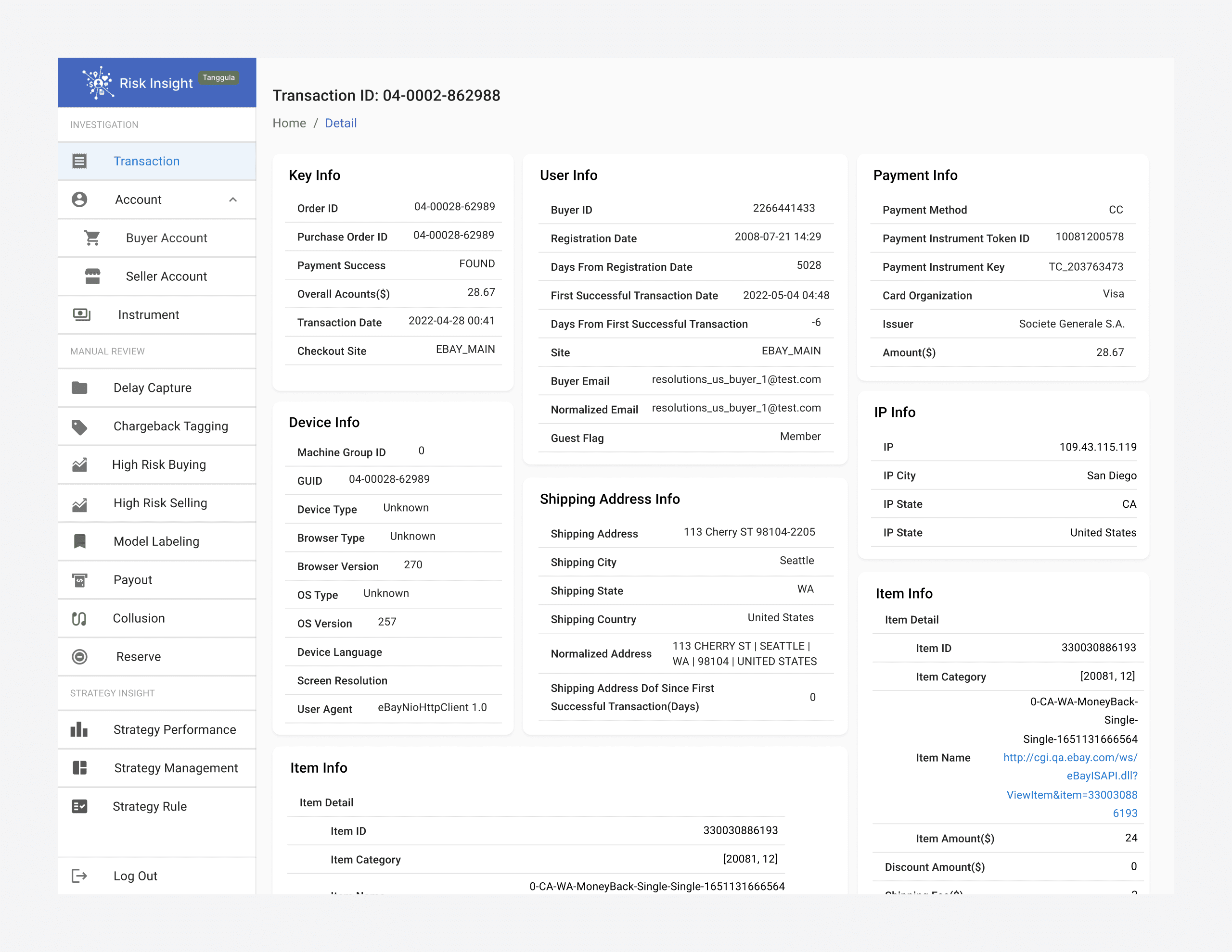
Risk Insight V1.0
Visual Exploration: Build a rigorous, professional image
At the project's onset, we decided against developing a new design system due to the extensive design and development resources it would require and the need for ongoing iterations. Given that the first version of Risk Insight was developed using MUI React, this provided a more practical starting point.
Thus, we quickly determine our visual design strategy:
Clarify the Risk team's product visual style.
Adjust global design tokens (Color, Radius, Typography, Shadow) in MUI for the desired visual effect.
Further fine-tune component level design tokens for detailed adjustment.
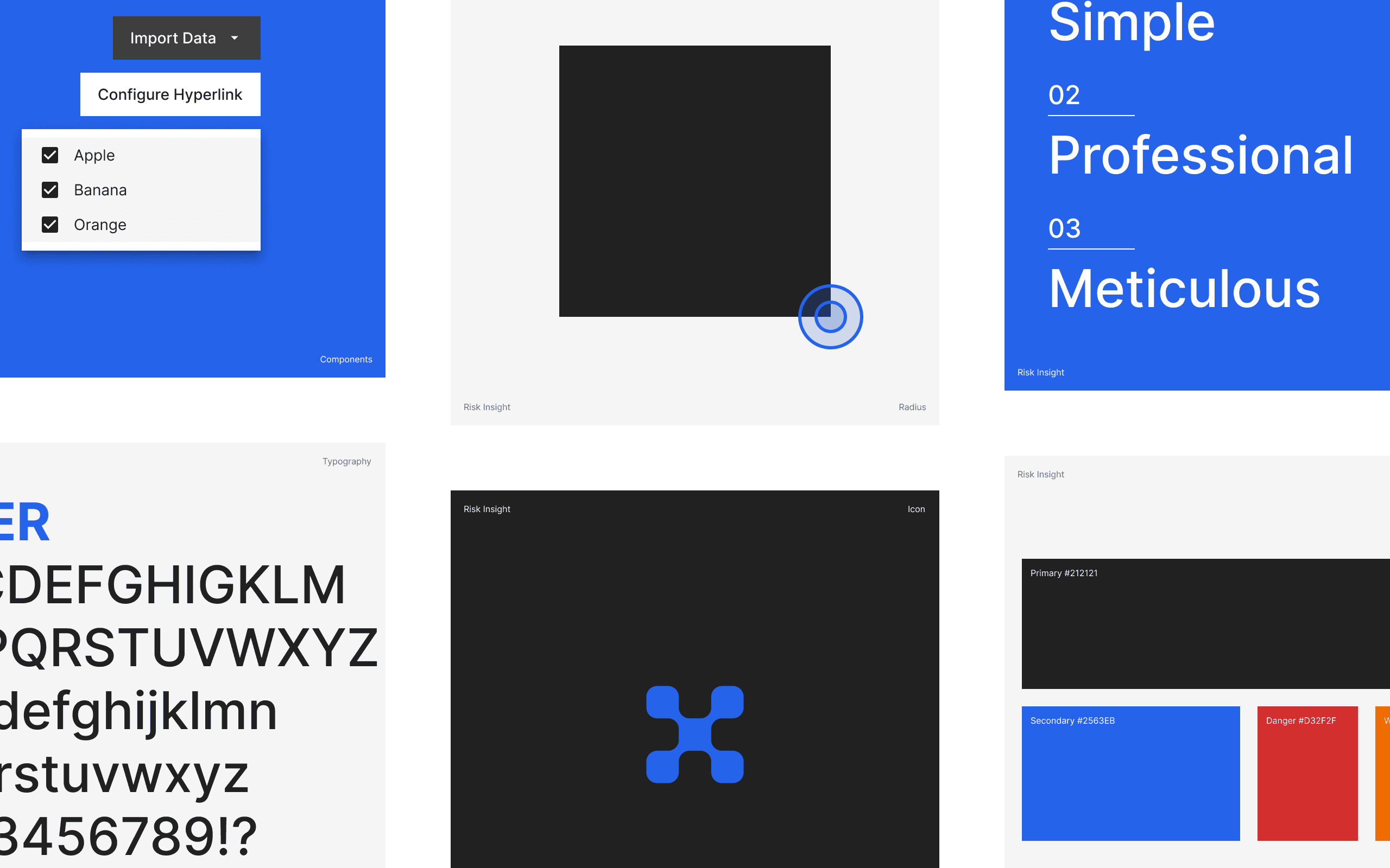
Organizing a team meeting, I facilitated a discussion where colleagues expressed what they wanted the product be visually represented and felt. Through this discussion, we identified 3 adjectives as our values out of 50+ keywords: simple, professional, and meticulous.
Guided by the keywords, I began adjusting the global tokens, to experiment with various visual effects. After iterating through to the 3th version, we finally settled on the visual style we were aiming for.
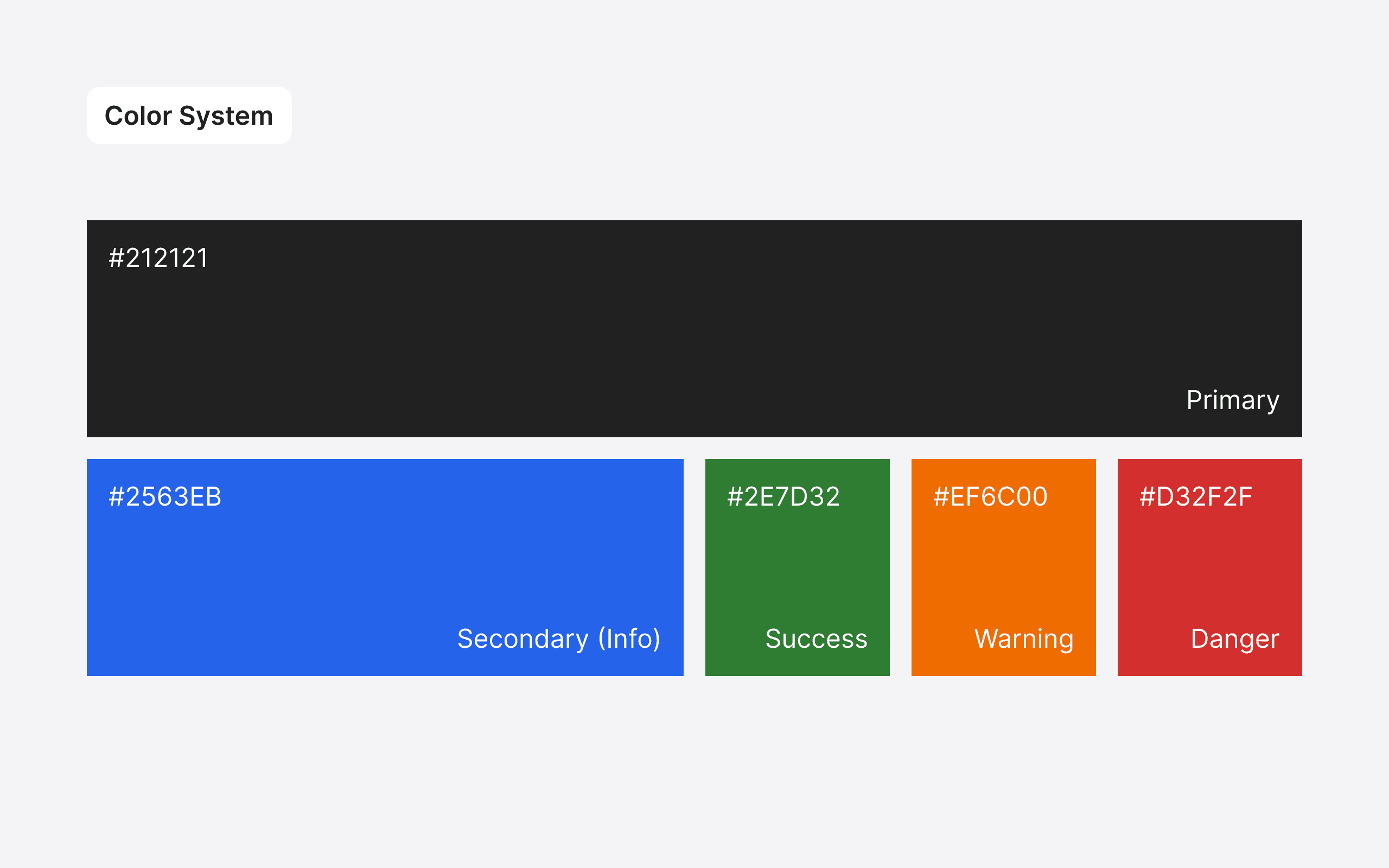
In our color system, black (#212121) was chosen as the primary color to reflect the product's professionalism and attention to detail. The original blue (#376FD0) transitioned to a secondary color, utilized primarily for logos, feedback components, and data visualization. This blue effectively balances the stark contrast brought by black, adding a hint of warmth to the product's overall aesthetic appeal.
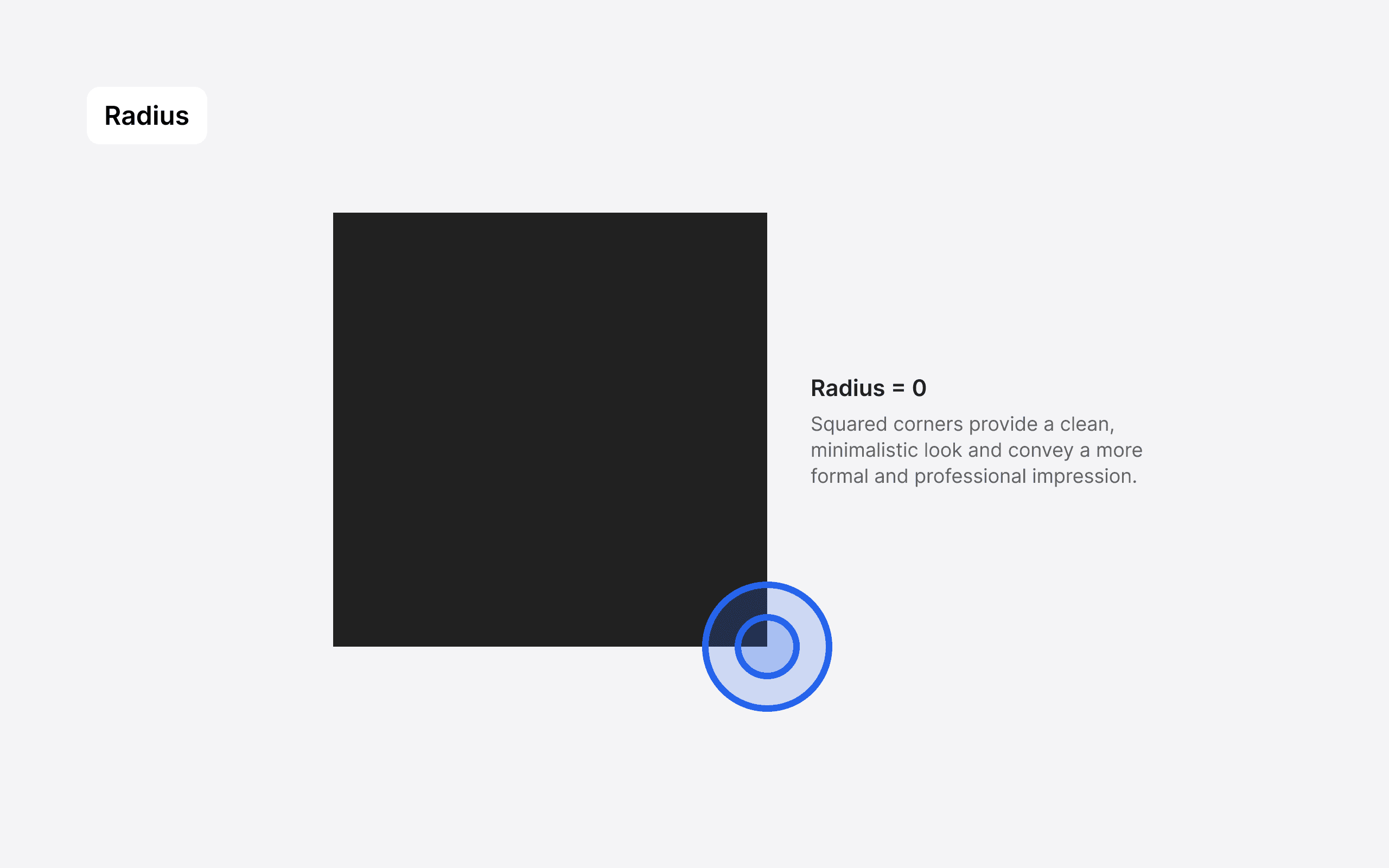
For the radius, we opted for a sharp, right-angled design, which enhanced the product's professional and meticulous characteristics.
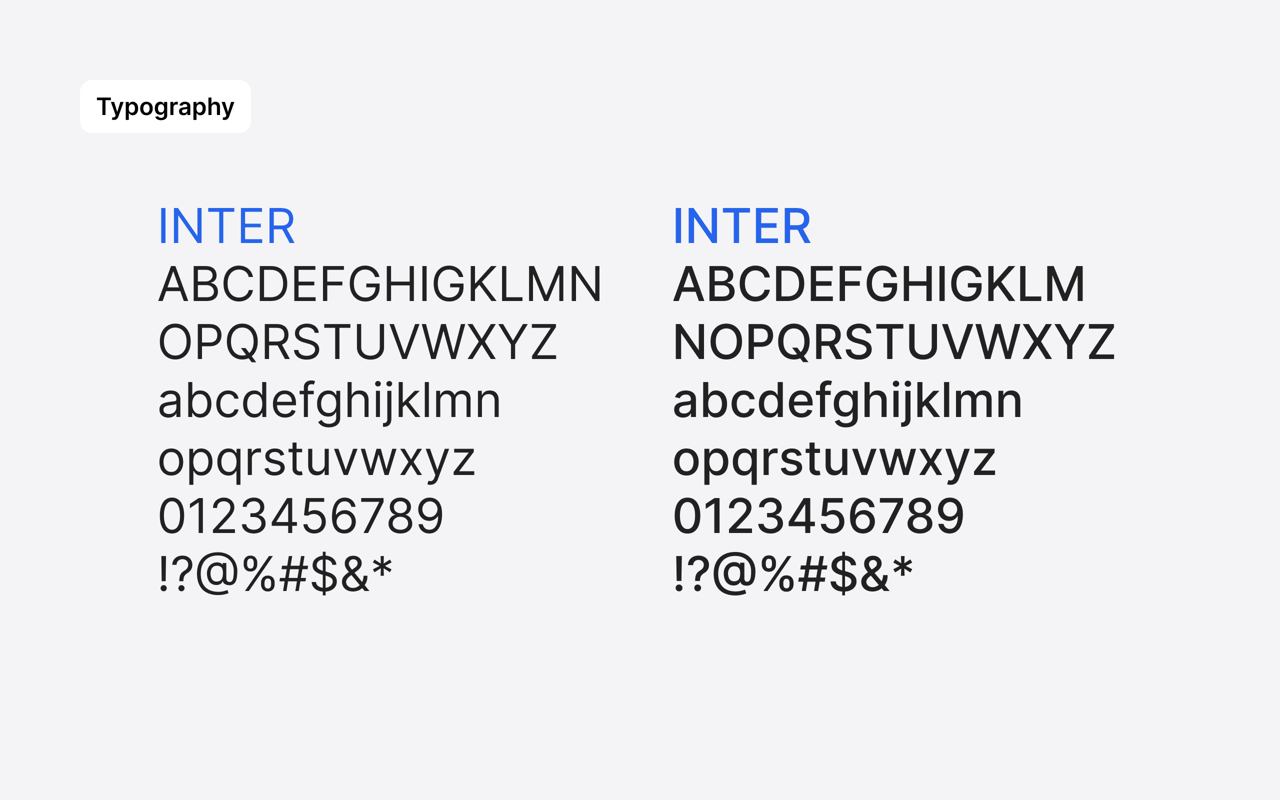
We uses Inter as our font. Inter font offers excellent readability with its clean and clear letterforms, making it easy for users to read text content on websites. This is crucial for providing a great user experience. Additionally, Inter font comes with various font weights & styles, allowing designers to flexibly adjust the appearance of text to meet different design needs.
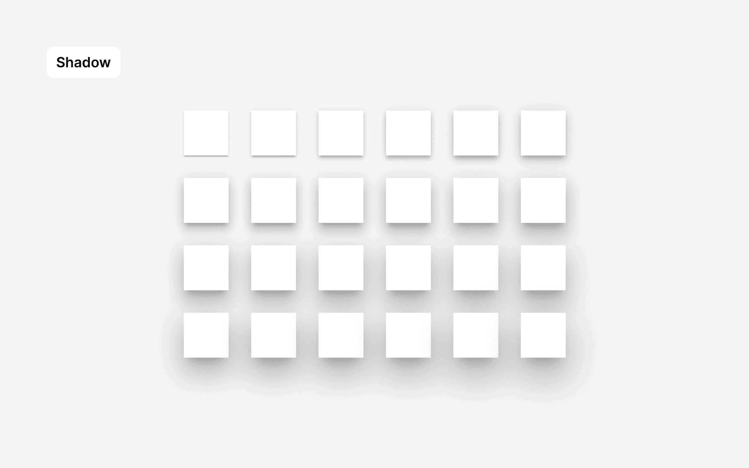
As for shadows, we decided to use MUI's original shadow settings. These were already effective in adding a sense of space to the interface and creating clear visual layers.
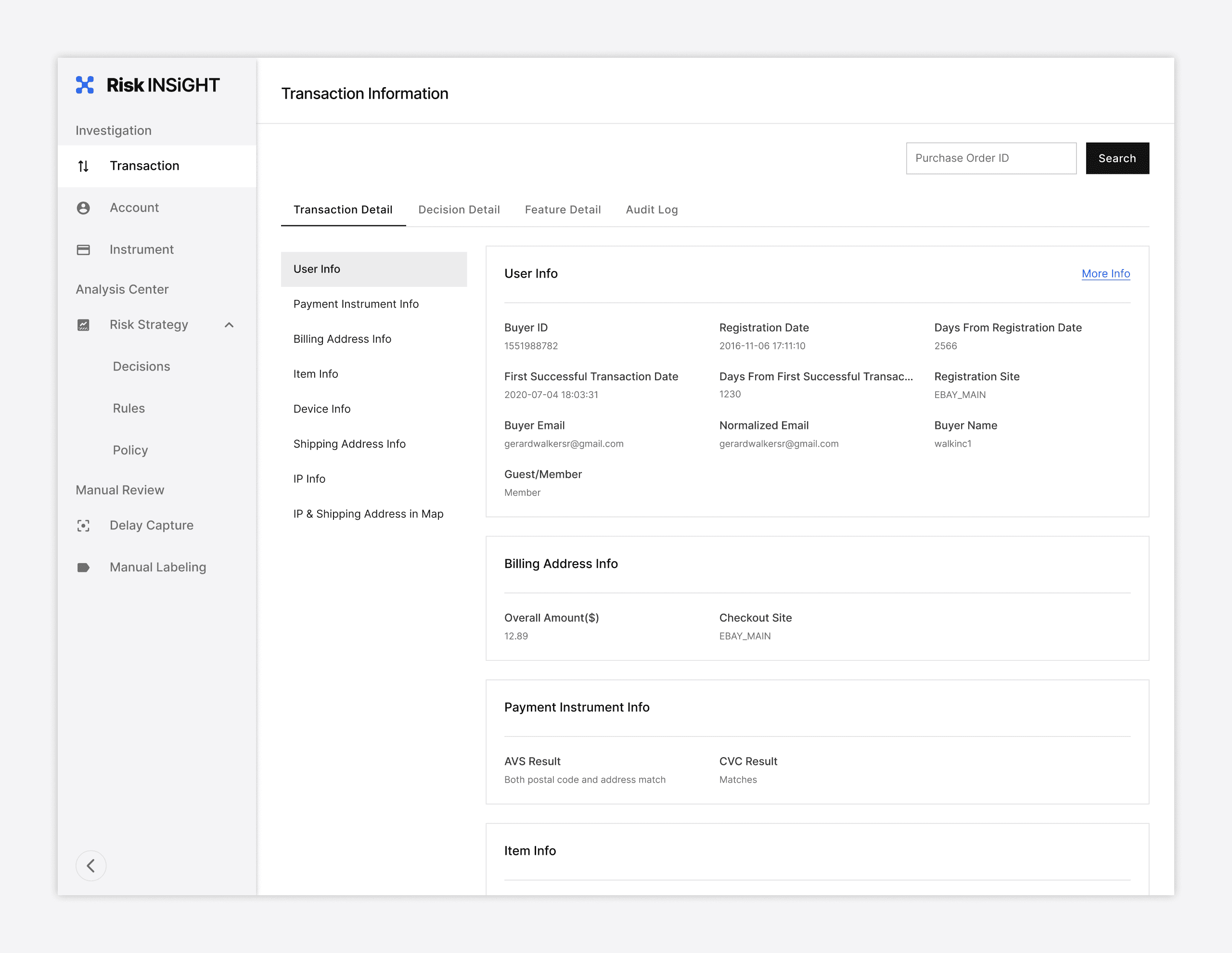
Consequently, with some fine-tuning adjustments, we successfully crafted the beta version of Risk Insight 2.0. However, the design refinement process was continuous and in-depth. Merely adjusting global design elements wasn't enough to fully transform the product into what we envisioned. Hence, I planned to synchronize component-level updates with improvements in user experience (UX). This strategy meant iterating and optimizing components in real business scenarios, ensuring each update closely aligned with user needs and business objectives. The subsequent results validated the effectiveness of this approach.
Risk Insight V2.0 beta
Experience Upgrade: Thinking from User Workflows and Product Update
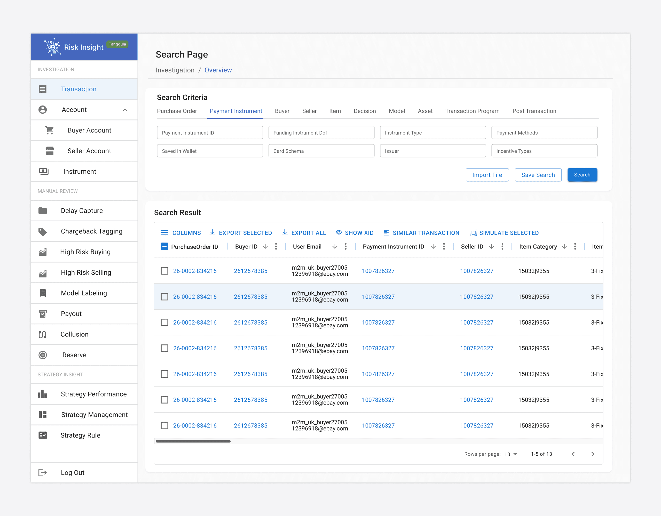
Before delving into the details of the experience upgrade, it’s crucial to outline the core functionalities of Risk Insight. It comprises three main modules: Investigation, Analysis, and Review. Currently, the Analysis and Review modules are still in the conceptual and developmental stages. The Investigation module, on the other hand, is relatively well-developed and the most frequently used by users. In this module, users can query data related to Transactions, Accounts, and Instruments. The typical user workflow involves: entering search information → browsing search results → viewing detailed data.
Given this, my upgrade efforts were primarily focused on search pages and results pages. These interfaces are where users interact most frequently, and optimizing them would directly enhance user efficiency and satisfaction.
Search Page: Customizable Search Capabilities
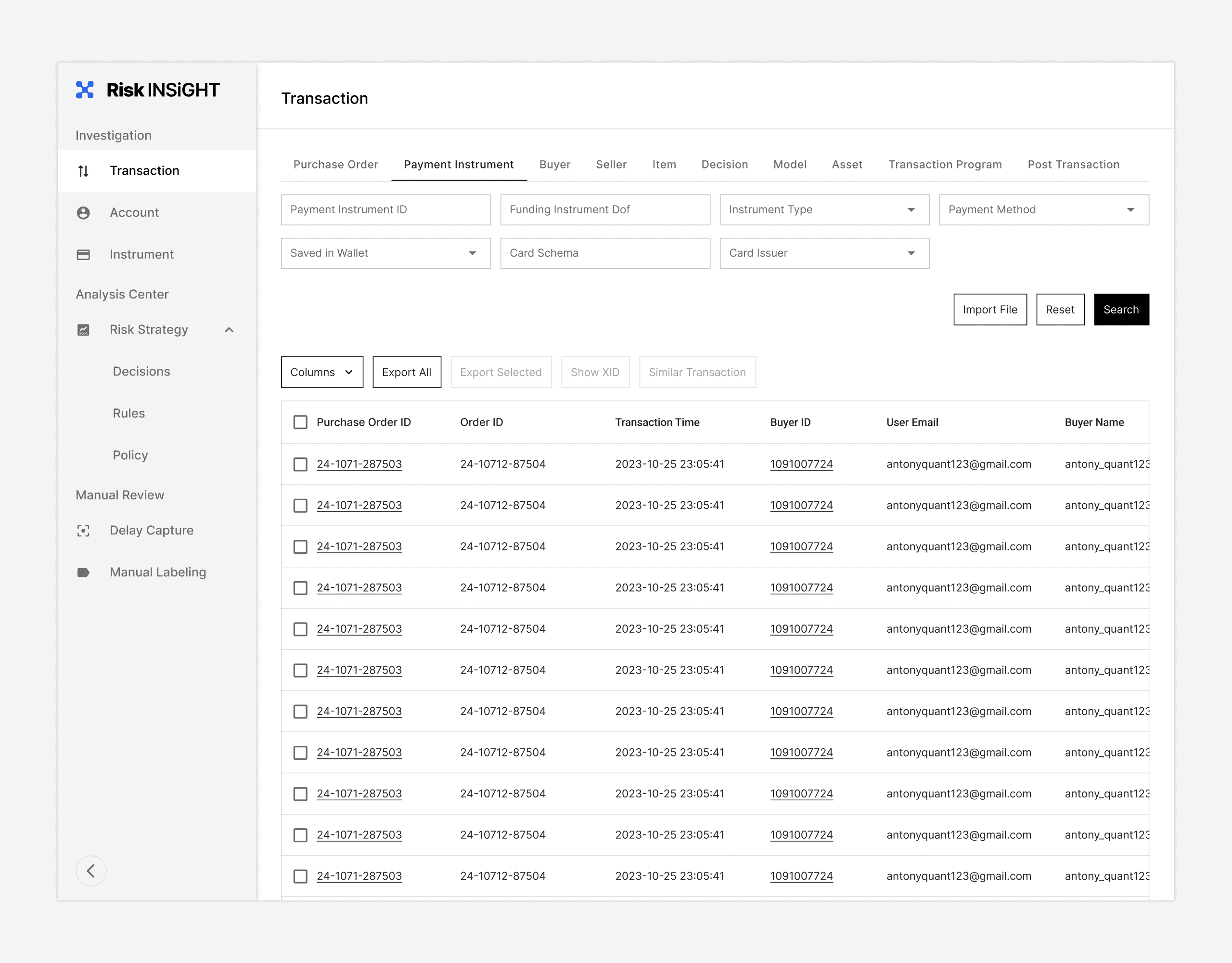
Currently, Risk Insight has approximately 220 users spread across 15 different teams, with each team having its unique data requirements. To meet these needs, Risk Insight offers a range of filters, enabling users to search across multiple dimensions. For instance, in transaction search, there are about 10 tabs and over 80 filtering options. While this design caters to diverse requirements, it leads to inefficiencies in searching and information retrieval. Users frequently need to switch between tabs to locate the required filters, significantly impacting the efficiency of teams that conduct extensive, broad searches daily.
Transaction Searching Panel in Version 1.0
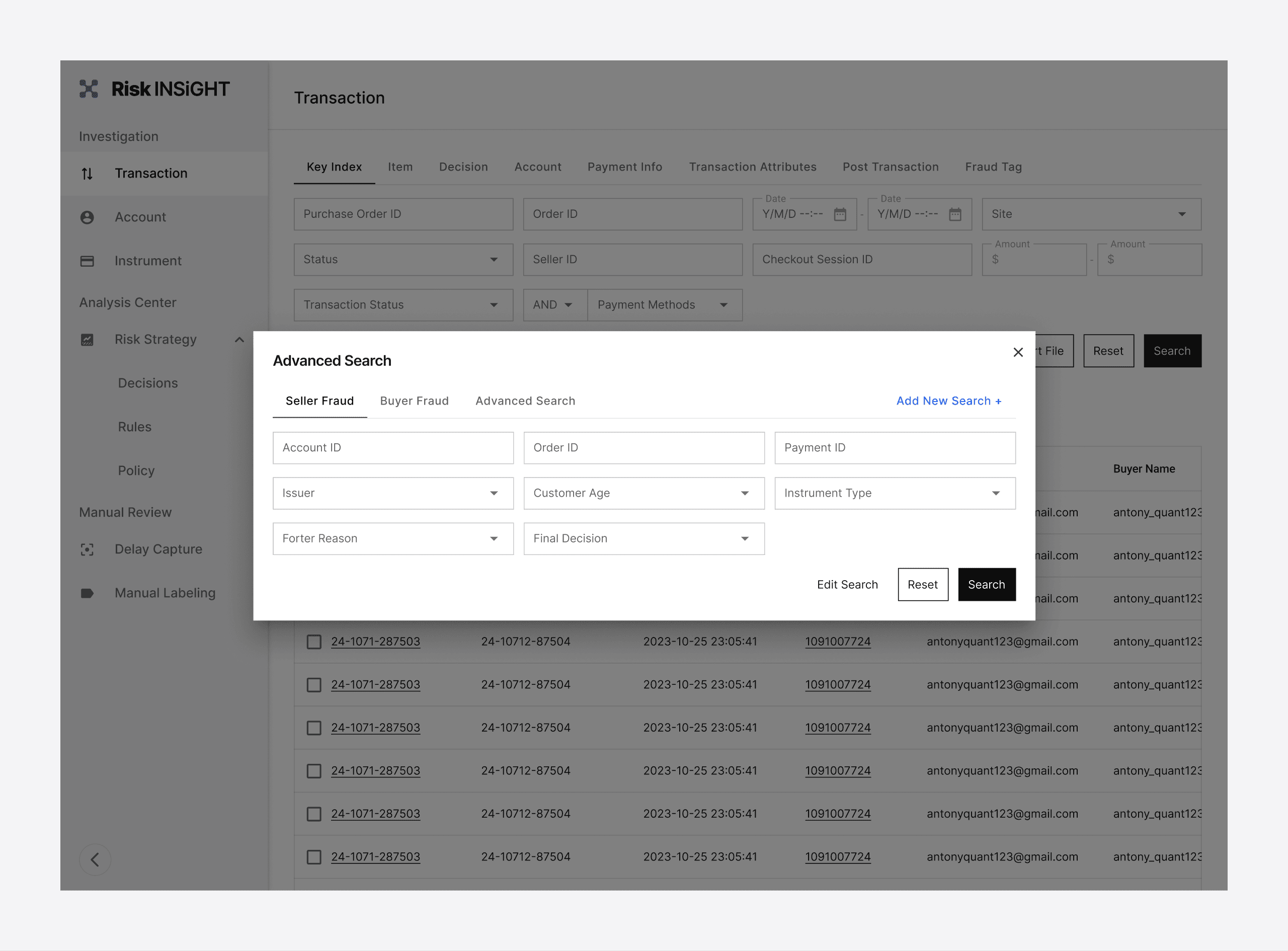
To enhance the existing search experience, we first adopted different components to distinguish various types of filters, such as input fields and dropdown menus, thereby clarifying each filter's basic interaction. Additionally, we reorganized the current filters, grouping the most frequently used ones into the "Key Index" tab for quicker access and application by users.
Transaction Searching Panel in Version 2.0
The most crucial improvement was empowering users with the ability to search quickly. We noticed that different teams typically used certain filter combinations frequently and consistently. Therefore, we introduced a new feature ‘Advanced Search’ allowing users to create and save customized search tabs. This enabled users to complete routine searches more rapidly, significantly enhancing work efficiency.
Result Page: Solving the problem of presenting data in the present and future
After updating the search page, we shifted our focus to optimizing the results page. The current results page employed a popular 'bento box' design, where data was grouped and displayed in a series of cards. While this design approach was visually appealing, we needed to consider whether it was the best fit for our product.
A significant issue with the current page was overwhelming information on the screen, leading to visual fatigue for users who viewed it for extended periods and making it difficult to find the needed data. Additionally, the Risk Insight data page regularly receives requests to add new data, requiring us to find appropriate spaces in the existing interface for these additions. This continual process of adding new data often disrupted the visual appeal of the original card design, as the new data could change the card's preset height and width.
In light of these issues, we decided to abandon the original bento box design. To address those problem mentioned, we made several key improvements to the new results page:
· A top tab bar: this provides higher-level data categorization, facilitating the addition and management of new data.
· Simplified Layout: we moved away from the complex bento layout to a more straightforward, vertically arranged format.
· More Free Space: To solve information overwhelming issue, we add more space between data & card to ensure the interface wouldn’t appear too cluttered visually.
· A side navigation tool: the new result page resulted in reduced screen efficiency, but the side navigation tool allows users to locate and access data quickly, thus guaranteeing data retrieval efficiency.
New Design Library
Although we consistently used MUI React as the development framework for Risk Insight, the team had not previously purchased the MUI Figma design system library. This led to a past update process where product managers drew wireframes, and developers implemented them based on their interpretation. This approach often led to a high incidence of all kinds of small issues.
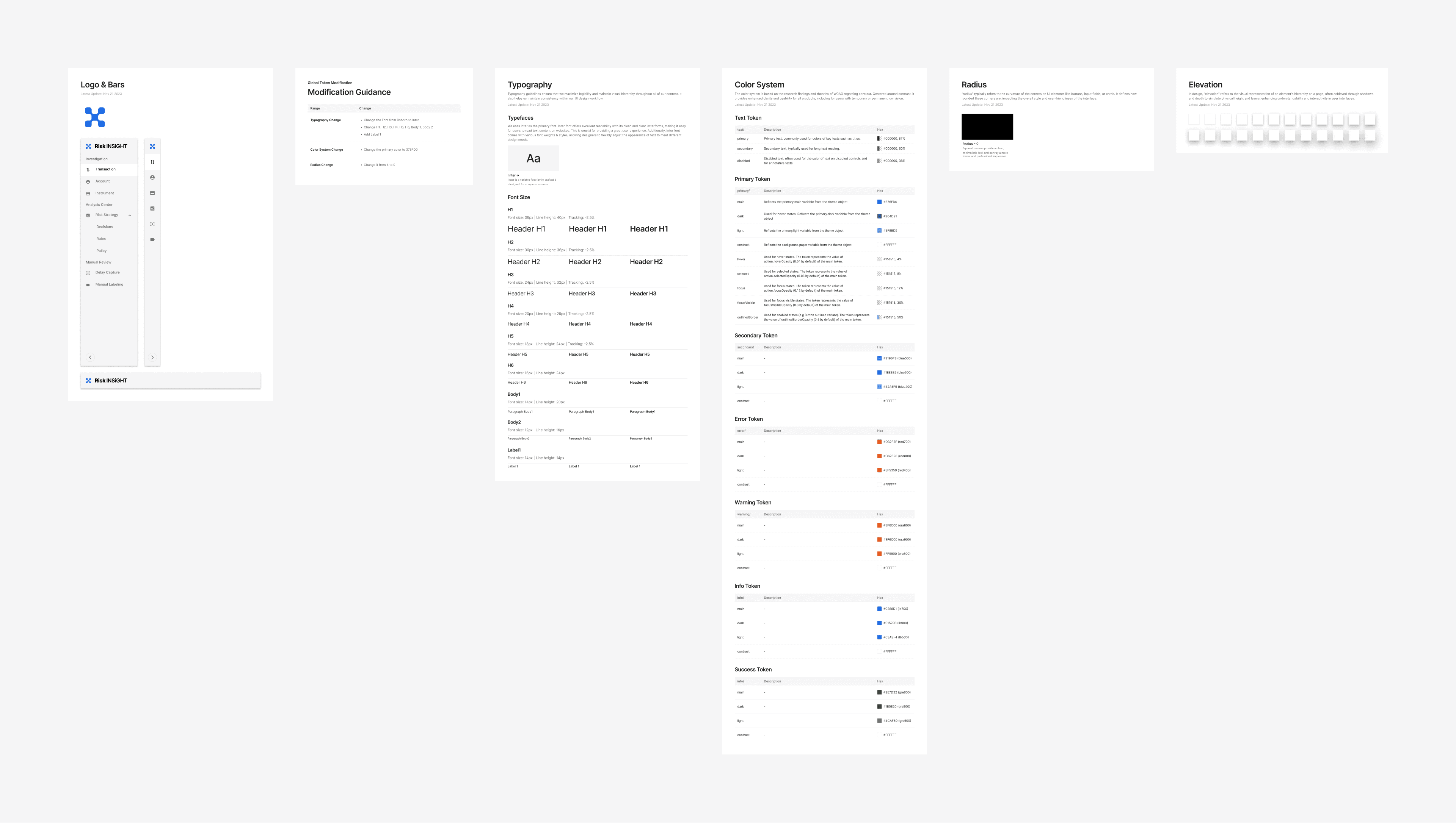
Therefore, before the project began, I proactively proposed the purchase of the MUI design system library's Figma file and successfully obtained approval. This design library file has also become the basis for our subsequent updates. After updating the global tokens, I documented all the changes in the design system library and handed them over to the development team to ensure their development library's styles stayed aligned with our design library. Additionally, whenever I updated a specific component, I will record those modifications chronologically in that component's page within the design system file, ensuring developers could accurately implement these changes in the code.
Global Token Modification Record
Lastly, to further improve efficiency, I created Page Templates for the search and results pages within the Figma library. This allowed for these templates to be directly used when adding new features in the future.
Summary
Although this UI/UX upgrade didn’t involve the immense time and effort of creating a brand-new design system, the process was actually more time-consuming than anticipated. Some plans, like the data visualization library and the design patterns development, were not fully realized.
However, the outcome of this upgrade was satisfactory to our team. After completing the global token update, the Risk Insight developed new pages were fully aligned with the design drafts, marking a significant improvement. Furthermore, product managers can now quickly build high-quality pages using the component library, which is crucial for enhancing the team's work efficiency and product quality.
Lastly, I'm deeply grateful to the team for giving me the opportunity to lead such a significant project as an intern. Your trust means a lot to me. : )
